Thursday, 12 December 2013
Moodboard for Themes of 'When We Wake'
A collage of different movie scenes relating to a post-apocalyptic setting. This is how we pictured the world to be like in the era our film is set, when Daisy wakes up to a world torn apart by a war and the world is in chaos as the small group of survivors try to stay alive. The green forest representing the woods in which we first see Daisy, and where the other survivors are hiding. The various images of ruined cities, nuclear explosions and cities on fire are the image of what the world is like now (in our film) after the attack, which is what the survivors are escaping from. The top left and right pictures represent the mood of the survivors as their hope wavers and they start to give up. The centre left image is a representation of their dream of freedom, escaping the attacks and finding a new peaceful life for themselves. Finally, the centre image, it represents the survivor's need to stay together and protect each other, their closeness and unity.
How I Live Now - Poster Analysis
This is the official poster for another one of film's inspirations - 'How I Live Now'. Taking up the majority room of the poster, under the title we have it's tagline "Love will lead you home". Straight away we have an insight into one of the film's themes, love. Next to the title and tagline is an image of the main character, played by Saoirse Ronan. A teenager who's life has been torn apart by world war. She is depicted as a typical teenager full of attitude, no different to any other teenager but that's about to change. The tagline and title tell us that she has been ripped away from her home and her normal life. A main part of the story is her trying to get back home to her family, so if love will guide her home, it has to be a very strong aspect of the plot.
The colours used are very heated, with use of reds, oranges and yellows to create an almost nuclear look. Hinting to what might have happened to have Saiorse's character ripped away from her home. The font of the text used is quite damaged-looking and worn down, by the effects of war and neglect. I like the use of the colour to reflect the themes of war and danger, something that we will have to use for our film as it is set in a post-apocalyptic future, damaged and beaten by war.
Friday, 6 December 2013
The Hunger Games: Catching Fire - Poster Analysis
In this poster of the second instalment of The Hunger Games, Katniss is portrayed as significantly more heroic and less innocent than she was depicted within the first film and poster. She is the only character on the poster, indicating that she is the main character in the film. Her expression and stance, with weapons drawn and loaded, show she is back and this time, she's ready to fight back against The Capitol. The colours she's surrounded by, the blazing red flames, represent the colours of rage and fury; recurring emotions for Katniss in this film. Here in the poster, she is standing in front of the same Mockingjay symbol that is on the Catching Fire book.This is another way to link both the film and book through other means than just the story and plot. The tagline reads "Remember who the enemy is", a direct reference to the book as this is what Haymitch says to Katniss in the book before she enters the arena for a second time. The line is also key to the story as it foreshadows the dark and dangerous twist of events that are to come. Not to mention it acts like a hook for the fans who have read the book, as it shows that the film is following the book with detail, compared to the first film.
I love the use of the colour within the poster and the way it matches the theme of the story and how the main character is placed at the front in the centre, showing her importance and significance. This is something I would like to with our main character, Daisy, as she is the main character in the film. I would also like to use colour which communicates the feel of the film in the poster, for example dark, gloomy colours which set an apocalyptic feel before even watching the film.
I love the use of the colour within the poster and the way it matches the theme of the story and how the main character is placed at the front in the centre, showing her importance and significance. This is something I would like to with our main character, Daisy, as she is the main character in the film. I would also like to use colour which communicates the feel of the film in the poster, for example dark, gloomy colours which set an apocalyptic feel before even watching the film.
Thursday, 5 December 2013
Start of Storyboard
Here is the start of the story board I created for the scenes in the opening of our film, using fine liner. I have yet to add the last 3 shots which involve a close up shot of Daisy's face as we see her wake up. Closing in on her eyes for 5 seconds until we see them open. Similar to the last shot of Twilight: Breaking Dawn Part 1, when Bella awakens from her transformation from human to vampire, as shown below:
Wednesday, 4 December 2013
Dates for Filming
We've decided to film on the 7th and 8th of December; this weekend. This way, we can take full advantage of our time and get plenty of filming done so we have more footage to edit and analyse.
Soundtrack
What we would love to do would be to create a soundtrack inspired by The Hunger Games's soundtrack. It is a brilliant soundtrack and suits the style of the film perfectly. What i love most about it, is that it is natural. No electronic sounds, just instruments, such as the guitars, piano, violin and drums. Here's an example of the style of music we're aiming for:
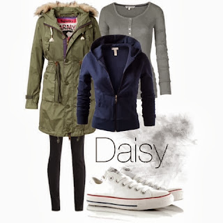
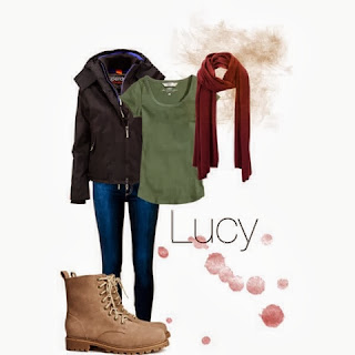
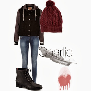
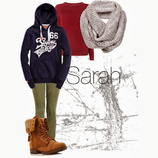
Costumes for our Characters
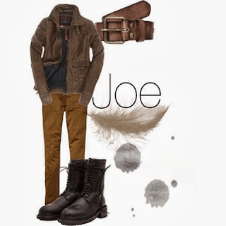
Here are the costumes that we decided on for our characters. Picture compilations by Kayleigh Cooper. We decided to go for colours that would blend into our surroundings, not clothes that would stand out and make our characters vulnerable.


Examples of our Costume Make-up
Here is an example of the make-up our friend Laura Deveson created and applied for us. A few cuts and bruises to show the ware and tear of our characters as they try to survive.
Location Shots For Film
Here are the shots from the farm where we would have been filming.
Interior shots around the tipi in the woods.
Tuesday, 3 December 2013
Length of Film
Originally we were going to shoot the entire film and then select which sequence we wanted from the film to goo towards our final piece. Unfortunately, we don't actually have enough time on our hands to film all of it yet, so we have decided just to film the 2-4 minute opening to the film, 'When We Wake' instead.
Location Change
We've decided to change our shooting location from my farm to the woods in Eastry. As they are far bigger and provide a vast area of shooting. Eastry woods are more appealing in their appearance compared to my farms's woods. The new location should provide us with better shots and more space to work in.
Subscribe to:
Posts (Atom)


